Common Flagpole Hardware Components
You are likely aware that flagpoles come in many styles, colors, and sizes. What you may not know is how many different parts of a flagpole are...
1 min read
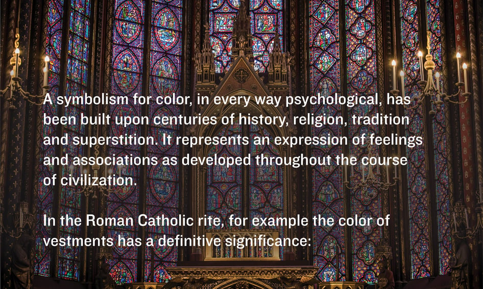
A symbolism for color, in every way psychological, has been built upon many centuries of history, religion, tradition and superstition. It represents an expression of feelings and associations as developed in the course of civilization. In the Roman Catholic rite, for example the color of the vestments has a definitive significance:
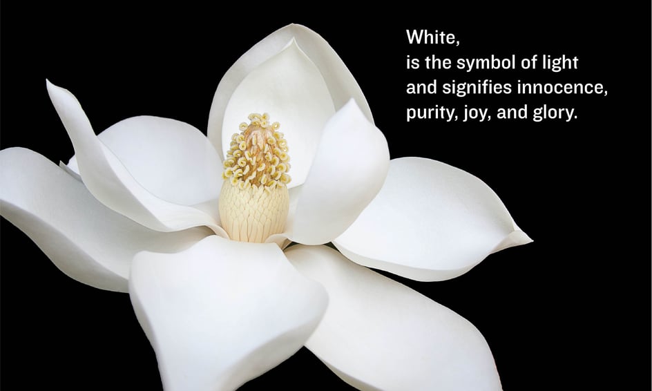
White is the symbol of light and signifies innocence and purity, joy, and glory.
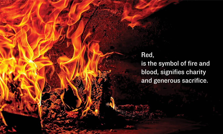
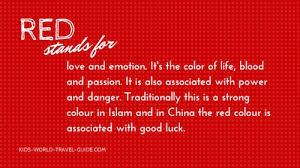
Red is the symbol of fire and blood, signifies charity and generous sacrifice.
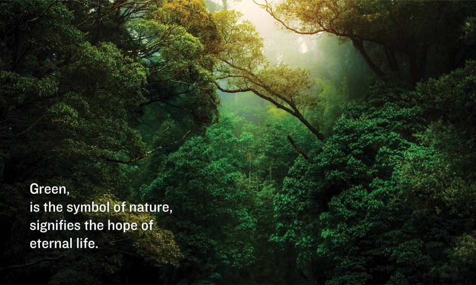
Green is the symbol of nature, signifies the hope of eternal life.
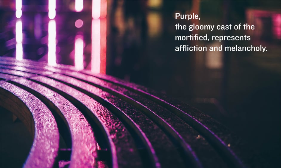
Purple, the gloomy cast of the mortified, represents affliction and melancholy.
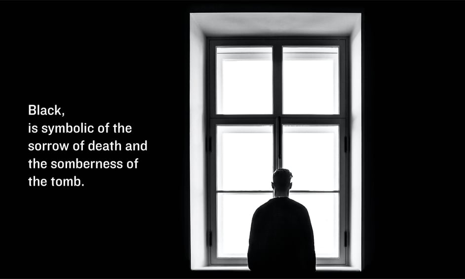
Black is symbolic of the sorrow of death and the somberness of the tomb.
Rhythm and Moods
Rhythm Is a combination of movement and patterns which can be used for expressive purposes. This can be done by concentrating on the spaces between the forms of the composition, or negative space. The spaces in between your subjects are where the eye pauses to rest, making these areas very important. The colors you assign to these spaces are a great help in enhancing whatever mood you plan to express.
These nebulous, in-between spaces begin to take on size and shape when they are viewed objectively and independently, and they will provide an added means of expressing certain mood effects.
Calm Mood
Suggested nylon colors: Bell Blue, Peacock, Lilac, Amber, Sandalwood, Nickel, Black
If the forms of your subject are spread out, separated by evenly proportioned in-between spaces, you’ll have a contemplative calm, independent slow-moving rhythm throughout the composition. This coupled with your choice of colors, will greatly enhance a calm mood. Create a horizontal rhythm with evenly proportioned in between spaces separating each feature which in turn creates a slow-moving rhythm throughout. This along with the choice of colors will create the calm mood.
Expressing Serenity
Suggested nylon colors: All your blues, Amber, Sandalwood, Black, Nickel
It’s a well-known fact that horizontal line suggests placidity. Peace, horizon, and finality are all expressed by a horizontal line. The way we use this line, as well as the appropriate color scheme will give us the calm we are seeking. The colors that suggest calm are usually in the blue family. The large areas in your art board are the mood creating ones therefore give special attention to the colors you use there. Define the edges of the space and add horizontal texture to the area. You have created the feeling of serenity because you have used horizontally placed forms and have given them colors of soft blues, mauves and greys and warm tones.
You are likely aware that flagpoles come in many styles, colors, and sizes. What you may not know is how many different parts of a flagpole are...
The colors of a flag are chosen for reasons far beyond their aesthetic value. The colors and graphic elements of a flag are chosen carefully and...
The location sets the mood and tone for the entire event. With a custom backdrop, it is easy to create settings that are unique, focused and stylish...