2 min read
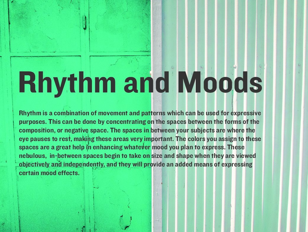
Rhythm and Moods
Rhythm Is a combination of movement and patterns which can be used for expressive purposes. This can be done by concentrating on the spaces between the forms of the composition, or negative space. The spaces in between your subjects are where the eye pauses to rest, making these areas very important. The colors you assign to these spaces are a great help in enhancing whatever mood you plan to express.
These nebulous, in-between spaces begin to take on size and shape when they are viewed objectively and independently, and they will provide an added means of expressing certain mood effects.
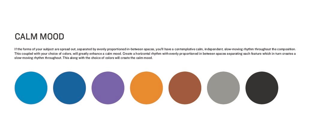
Calm Mood
Suggested nylon colors: Bell Blue, Peacock, Lilac, Amber, Sandalwood, Nickel, Black
If the forms of your subject are spread out, separated by evenly proportioned in-between spaces, you’ll have a contemplative calm, independent slow-moving rhythm throughout the composition. This coupled with your choice of colors, will greatly enhance a calm mood. Create a horizontal rhythm with evenly proportioned in between spaces separating each feature which in turn creates a slow-moving rhythm throughout. This along with the choice of colors will create the calm mood.
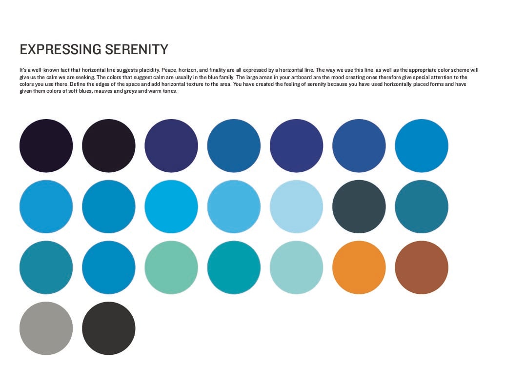
Expressing Serenity
Suggested nylon colors: All your blues, Amber, Sandalwood, Black, Nickel
It’s a well-known fact that horizontal line suggests placidity. Peace, horizon, and finality are all expressed by a horizontal line. The way we use this line, as well as the appropriate color scheme will give us the calm we are seeking. The colors that suggest calm are usually in the blue family. The large areas in your art board are the mood creating ones therefore give special attention to the colors you use there. Define the edges of the space and add horizontal texture to the area. You have created the feeling of serenity because you have used horizontally placed forms and have given them colors of soft blues, mauves and greys and warm tones.
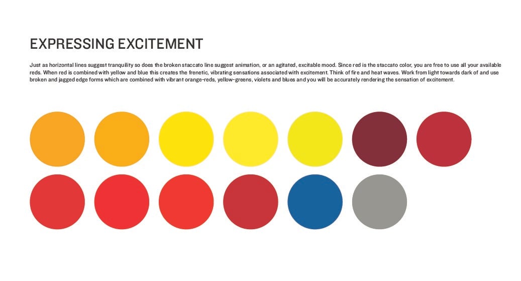
Expressing Excitement
Suggested nylon colors: all your reds, all your yellows, Peacock, Nickel
Just as horizontal lines suggest tranquility so does the broken staccato line suggest animation, or an agitated, excitable mood. Since red is the staccato color, you are free to use all your available reds. When red is combined with yellow and blue this creates the frenetic, vibrating sensations associated with excitement. Think of fire and heat waves. Work from light towards dark of and use broken and jagged edge forms which are combined with vibrant orange-reds, yellow-greens, violets and blues and you will be accurately rendering the sensation of excitement.
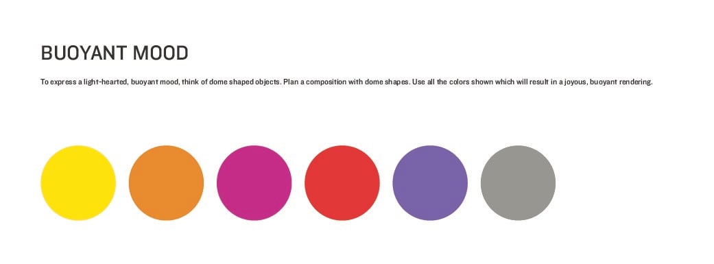
Expressing a Buoyant Mood
Suggested nylon colors: Daffodil, Amber, Orchid, Canada red, Lilac, Nickel
To express a light-hearted, buoyant mood, think of dome shaped objects. Plan a composition with dome shapes. Use all the colors listed above which will result in a joyous, buoyant rendering.
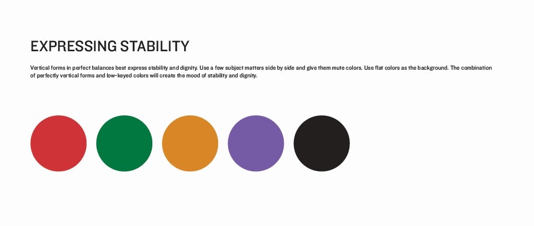
Expressing Stability
Suggested nylon colors: Canada Red, Bright Green, Amber, Lilac, Black
Vertical forms in perfect balances best express stability and dignity. Use a few subject matters side by side and give them mute colors. Use flat colors as the background. The combination of perfectly vertical forms and low-keyed colors will create the mood of stability and dignity.
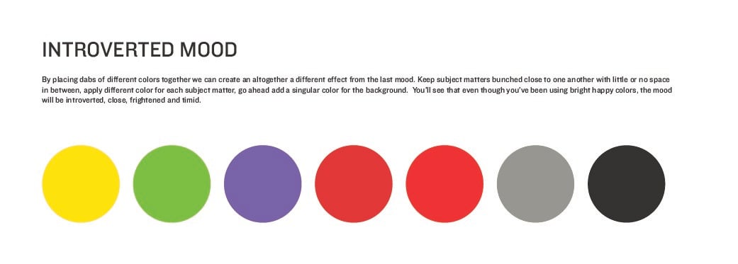
Expressing an Introverted Mood
Suggested nylon colors: Daffodil, Mint Green, Lilac, Canada Red, Bright Red, Nickel, Black
By placing dabs of different colors together we can create an altogether a different effect from the last mood. Keep subject matters bunched close to one another with little or no space in between, apply different color for each subject matter, go ahead add a singular color for the background. You’ll see that even though you’ve been using bright happy colors, the mood will be introverted, close, frightened and timid.
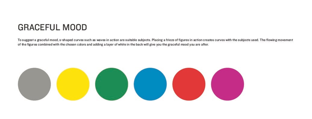
Expressing a Graceful Mood
Suggested nylon colors: Nickel, Daffodil, Bright Green, Bell Blue, Canada Red, Orchid
To suggest a graceful mood, s-shaped curves such as waves in action are suitable subjects. Placing a frieze of figures in action creates curves with the subjects used. The flowing movement of the figures combined with the chosen colors and adding a layer of white in the back will give you the graceful mood you are after.