2 min read
Top 3 Blogs for Event Planners
The event planning industry is huge and constantly growing and evolving. No matter where you are in your business, it pays to stay on top of what is...
1 min read
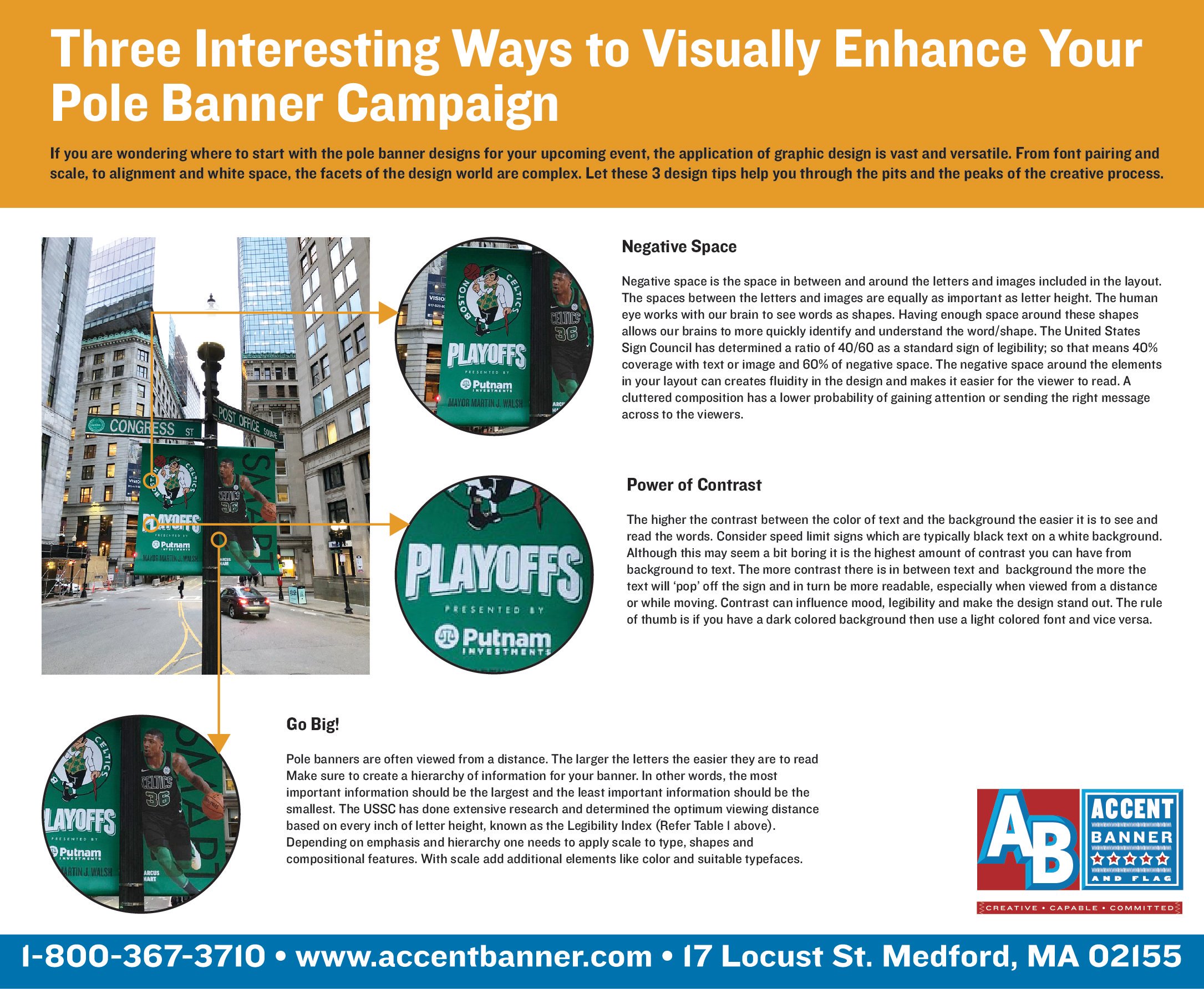
If you are wondering where to start with the pole banner designs for your upcoming event, the application of graphic design is vast and versatile. From font pairing and scale, to alignment and white space, the facets of the design world are complex. Let these 3 design tips help you through the pits and the peaks of the creative process.
Negative Space
Negative space is the space in between and around the letters and images included in the layout.
The spaces between the letters and images are equally as important as letter height. The human
eye works with our brain to see words as shapes. Having enough space around these shapes
allows our brains to more quickly identify and understand the word/shape. The United States
Sign Council has determined a ratio of 40/60 as a standard sign of legibility; so that means 40%
coverage with text or image and 60% of negative space. The negative space around the elements
in your layout can creates fluidity in the design and makes it easier for the viewer to read. A
cluttered composition has a lower probability of gaining attention or sending the right message
Power of Contrast
The higher the contrast between the color of text and the background the easier it is to see and
read the words. Consider speed limit signs which are typically black text on a white background.
Although this may seem a bit boring it is the highest amount of contrast you can have from
background to text. The more contrast there is in between text and background the more the
text will ‘pop’ off the sign and in turn be more readable, especially when viewed from a distance
or while moving. Contrast can influence mood, legibility and make the design stand out. The rule
of thumb is if you have a dark colored background then use a light colored font and vice versa.
Go Big!
Pole banners are often viewed from a distance. The larger the letters the easier they are to read
Make sure to create a hierarchy of information for your banner. In other words, the most
important information should be the largest and the least important information should be the
smallest. The USSC has done extensive research and determined the optimum viewing distance
based on every inch of letter height, known as the Legibility Index (Refer Table 1 above).
Depending on emphasis and hierarchy one needs to apply scale to type, shapes and
compositional features. With scale add additional elements like color and suitable typefaces.
2 min read
The event planning industry is huge and constantly growing and evolving. No matter where you are in your business, it pays to stay on top of what is...
When considering patterns for your flags and banners, you may consider designing them in either bitmap or vector formats. But you may be wondering...
Finding the right applique designs for your project can make a huge difference between a banner or flag that sizzles and one that falls short of...