1 min read
Event Planning Tips: Planning a Graduation Party
Graduation season is an annual event that marks the lives of many young people every year between May and June. This is the time of year when an...
2 min read
Graphic Design tips to help you build a creative and engaging banner for events like athletics, commencement, graduation, festivals etc. Let's discuss five major decisions one has to make while designing a banner:
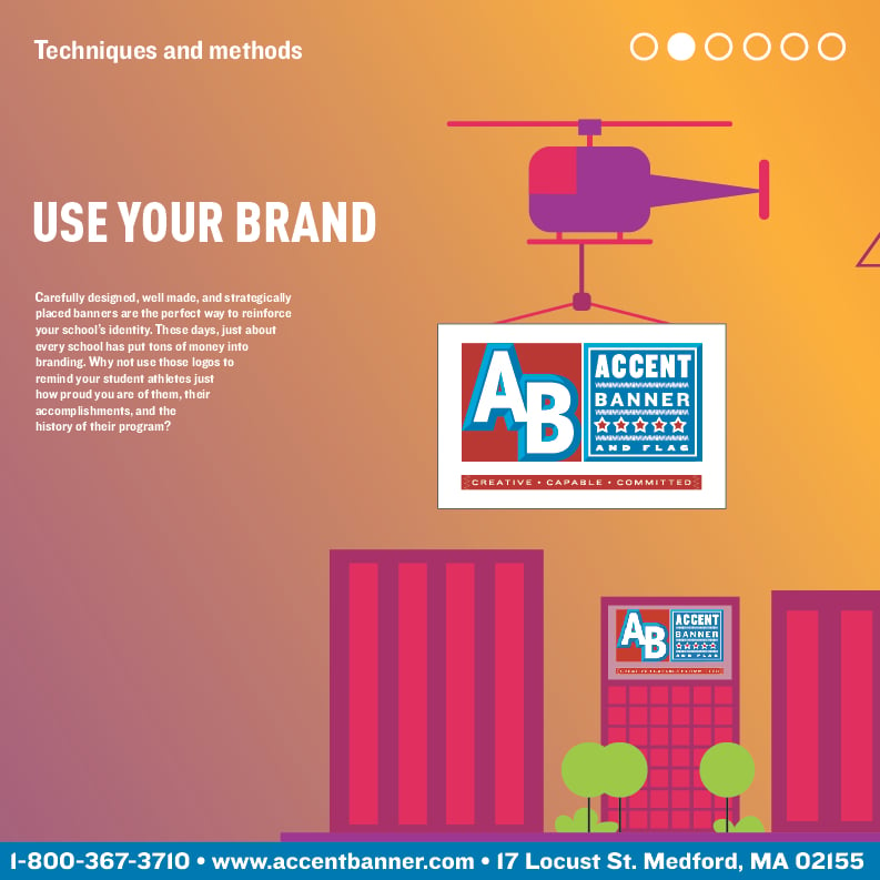
Use your Brand
Carefully designed, well made, and strategically placed banners are the perfect way to reinforce your school’s identity. These days, just about every school has put tons of money into branding. Why not use those logos to remind your student athletes just how proud you are of them, their accomplishments, and the history of their program?
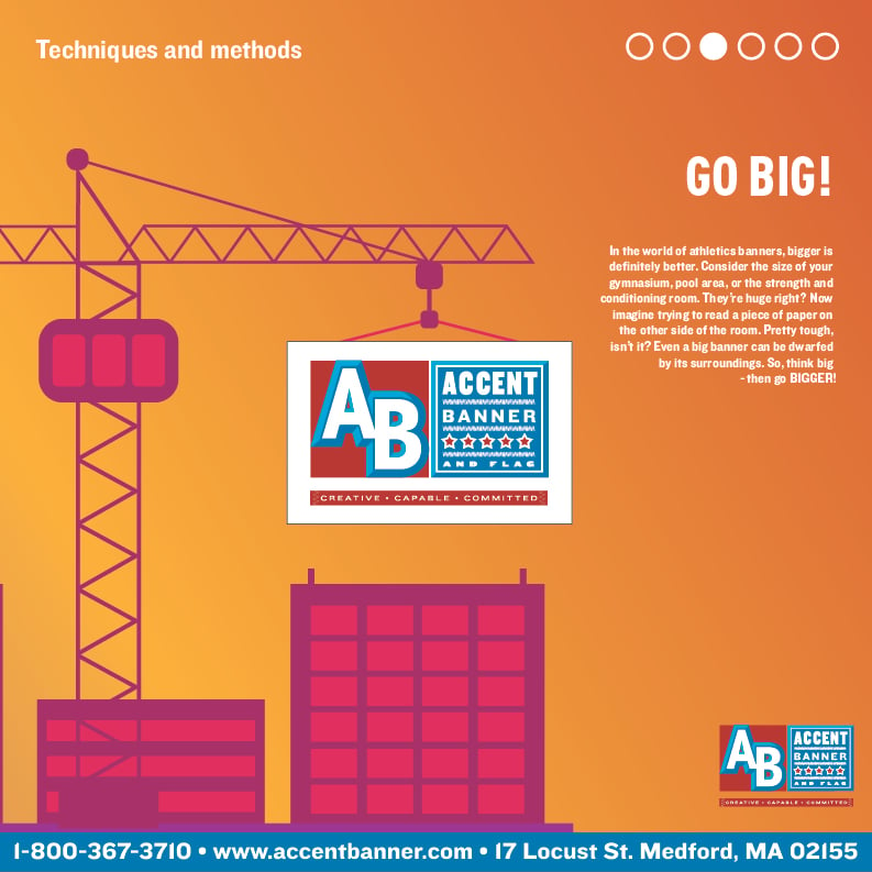
Go Big!
In the world of athletics banners, bigger is definitely better. Consider the size of your gymnasium, pool area, or the strength and conditioning room. They’re huge right? Now imagine trying to read a piece of paper on the other side of the room. Pretty tough, isn’t it? Even a big banner can be dwarfed by its surroundings. So, think big - then go BIGGER!
Typography
Typefaces (often referred to as fonts) fall into one of two main categories: serif and sans serif. Notice how the letters in this paragraph have little details on them, almost like each letter has little feet. Well, those little feet are called serifs. Now take a look at the quote down below. No feet. That typeface is known as sans serif, sans meaning no. Both styles of typeface have benefits and disadvantages. Choose wisely, as the wrong typeface can be challenging for the human eye, leading to legibility problems.

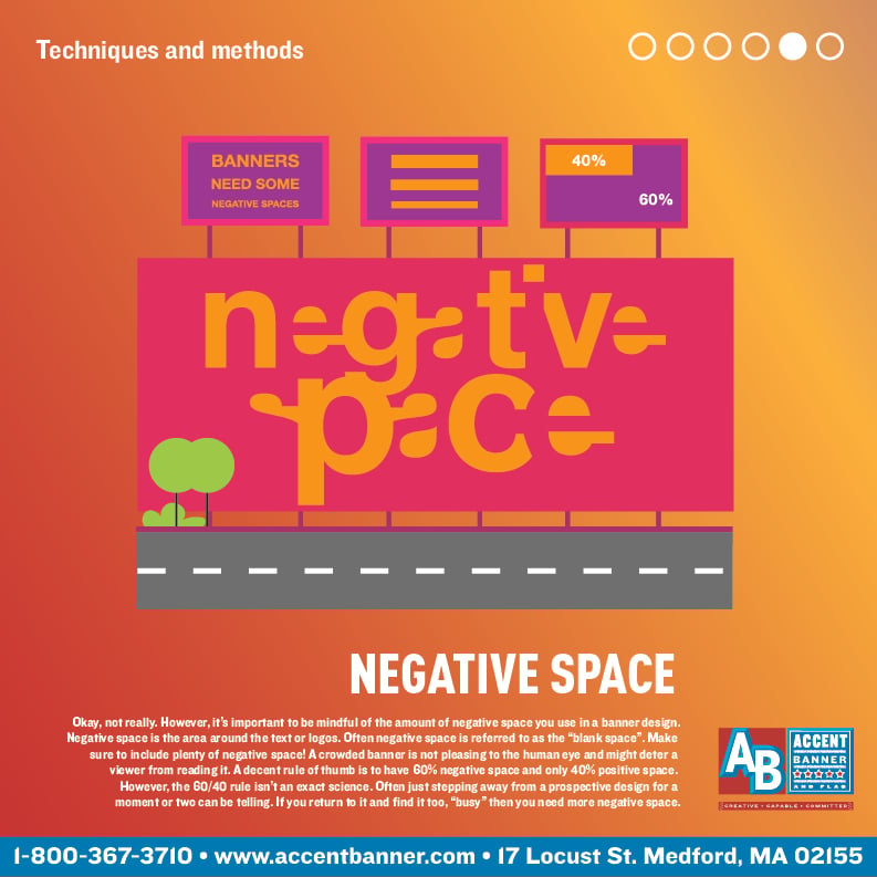
Negative Space
Okay, not really. However, it’s important to be mindful of the amount of negative space you use in a banner design. Negative space is the area around the text or logos. Often negative space is referred to as the “blank space”. Make sure to include plenty of negative space! A crowded banner is not pleasing to the human eye and might deter a viewer from reading it. A decent rule of thumb is to have 60% negative space and only 40% positive space. However, the 60/40 rule isn’t an exact science. Often just stepping away from a prospective design for a moment or two can be telling. If you return to it and find it too, “busy” then you need more negative space.
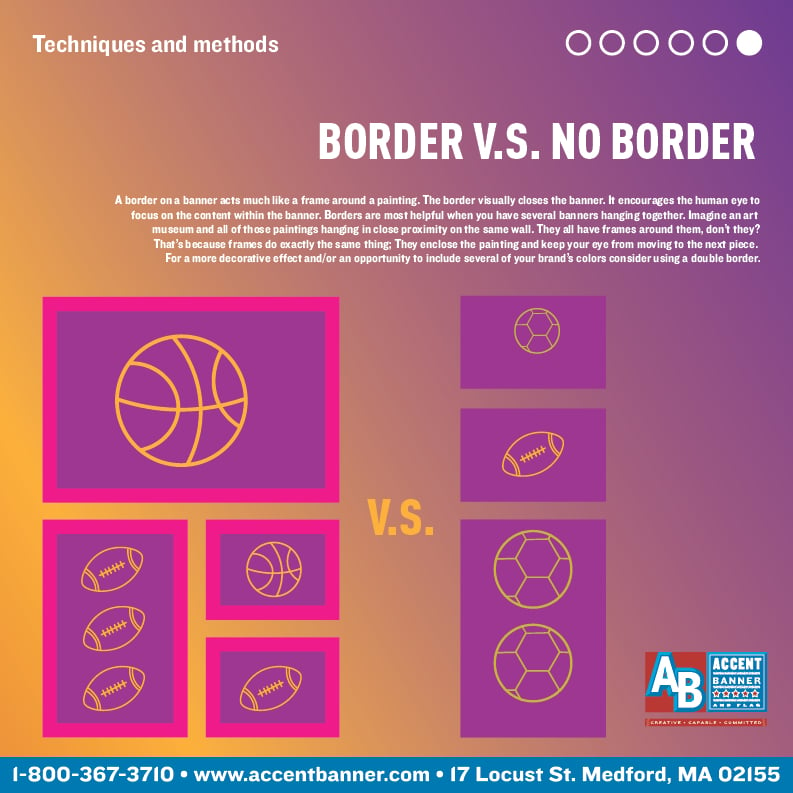
Border v.s No Border
A border on a banner acts much like a frame around a painting. The border visually closes the banner. It encourages the human eye to focus on the content within the banner. Borders are most helpful when you have several banners hanging together. Imagine an art museum and all of those paintings hanging in close proximity on the same wall. They all have frames around them, don’t they? That’s because frames do exactly the same thing; They enclose the painting and keep your eye from moving to the next piece. For a more decorative effect and/or an opportunity to include several of your brand’s colors consider using a double border.

1 min read
Graduation season is an annual event that marks the lives of many young people every year between May and June. This is the time of year when an...

Gonfalons When you're attending in or participating in a graduation, there's a lot of symbolism that is often overlooked. The long gowns go back to...
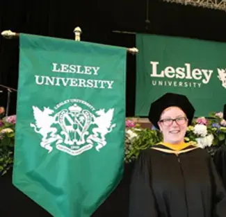
Gonfalons When you're attending in or participating in a graduation, there's a lot of symbolism that is often overlooked. The long gowns go back to...