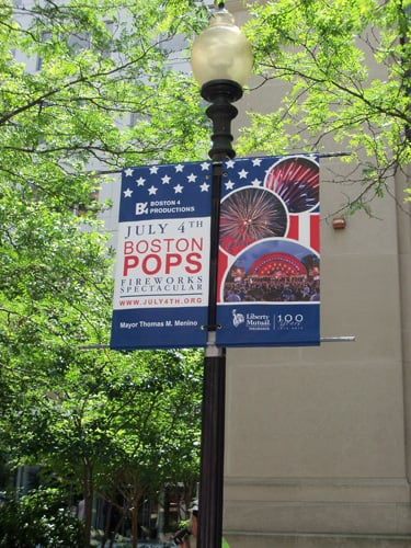
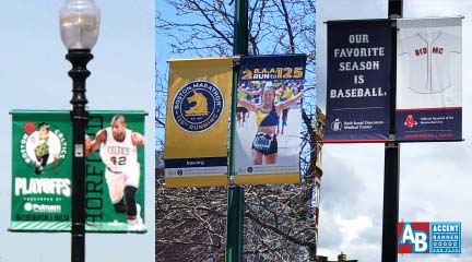
Light Pole Banners in Boston: 5 "No-No's" to Avoid
Thinking about displaying Light Pole Banners in Boston? Here's 5 things to avoid: There are several rules and regulations enforced by the City of...

Light pole banners have become a staple in the marketing and sign industries. They are a great opportunity to reach the public and make them aware of an event, performance, or sports team. Often sponsors choose to be included on pole banners as they are aware that they reach an audience much larger than their customer lists or even make online marketing which seems to be becoming the modern equivalent of junk mail. Below are a few tips to keep in mind when designing light pole banners. Utilizing these tips will help you get the most out of your design and is sure to make your sponsors very happy with the visibility of their corporate identity.
Any type of signage is most often viewed from a distance. The larger the letters the easier they are to read. Make sure to create a hierarchy of information when designing. In other words, the most important information should be the largest and the least important information should be the smallest. The United States Sign Council (USSC) has done extensive research and determined the optimum viewing distance based on every inch of letter height, known as the Legibility Index (LI). For example, a sign with an LI of 22 mean that 1” capital letters should be legible from a distance of 22 feet. Likewise 10” capital letters are legible at 220’. Additionally the LI also reflects a 15% increase in letter height required when all upper case letter are used instead of the more legible upper and lower case letters with initial caps.

Negative space in this sense is the space in between and around the letters and images included in a banner layout. The space around the letters/images is equally important as letter height. The human eye works with our brains to see words as shapes. Having enough space around these shapes allows our brains to more quickly identify and understand the word/shape. The USSC has determined a ratio of 40/60 as a standard for sign legibility. 40% coverage with text or image and 60% negative space.
In addition to letter size and the relationship of letter size to negative space, the greater the amount of contrast in color of text to background helps increase legibility. Consider speed limits signs which are typically black text on a white background. Although this may seem a bit boring it is the highest amount of contrast you can have from background to text. The more contrast there is between text and background the more the text will “pop” off the sign and in turn be more readable, especially when viewed from a distance while moving.

Looking to learn more about custom made banners and design? Try downloading ourFREE Guide Below!

Thinking about displaying Light Pole Banners in Boston? Here's 5 things to avoid: There are several rules and regulations enforced by the City of...

Light pole banner campaigns are very powerful marketing opportunities in and around Boston, MA. We have been providing a wide range of customers with...

This region in southern Sweden is trying to secure home rule; its flag is well known in Sweden. Scania was ruled by Denmark until 1658 and the colors...