Basketball Banners: 5 Design Tips
High Schools, Colleges, and Universities across America are very proud of their athletics programs. Few are prouder than the basketball teams and the...
2 min read

High Schools, Colleges, and Universities across America are very proud of the athletics programs. Few are prouder than the hockey teams and friends and families that support them. In this article we discuss 5 tips for making sure your custom hockey banners do your team proud.
Leave room
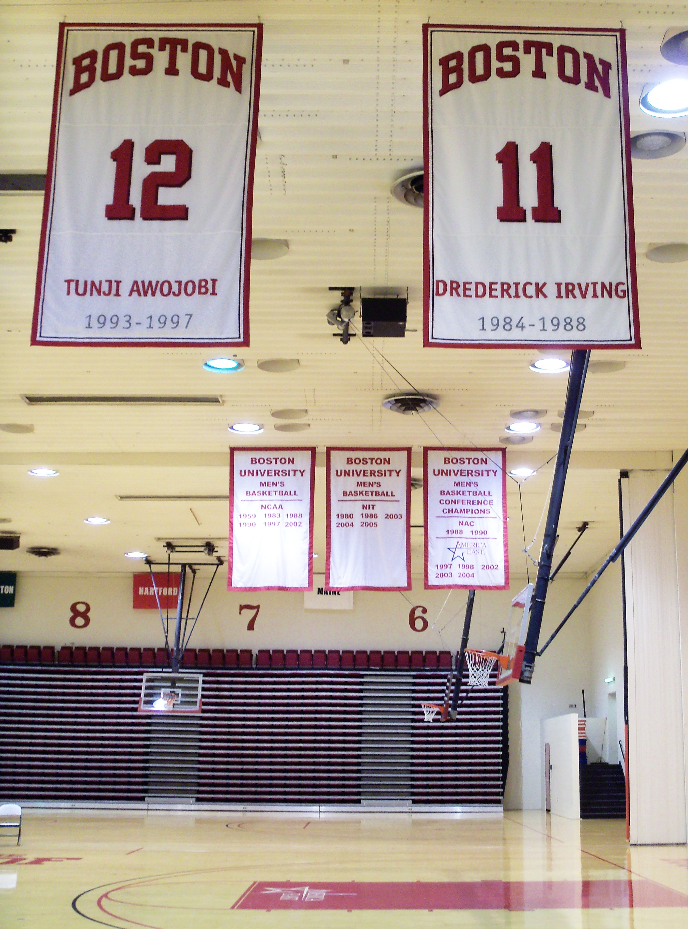
Plan ahead! There are tons of “Sam Hanks” and “Lisa Smiths” in the world but there are also lots of “William Robinson” and “Marietta Washington’s” out there. Make sure to leave plenty of space in between the player’s names and stats. Doing so will allow you to add player names without squeezing them in place or breaking their names into two lines. Nothing stands out more (in a bad way) than a line of text that has a different typographic treatment than the others!
Track the stats and double check them
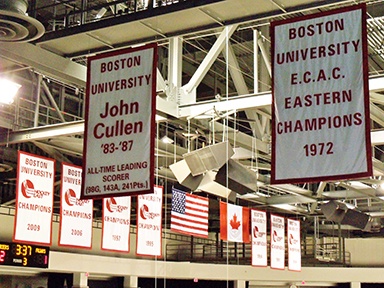
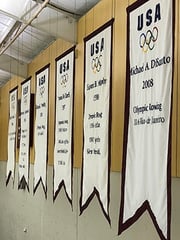 Every sport has a different set of benchmarks to grade an athlete’s achievements. In hockey the common statistics track a player’s total career points, shots taken, individual awards such as the Hobey Baker award, or group players who scored over 100 pts total. Some banners even honor players who went to play professionally or played in the Olympics. Team banners track tournament appearances and championships won. The important thing is to track each stat accurately and double check, even triple check them to be sure their right.
Go BIG!
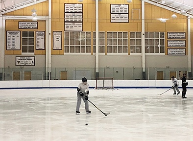
Keep in mind that hockey banners may be viewed  from the other side of the rink or even further if the banner is to be displayed behind the goals. Don’t make people in the stands squint to read the banner. Make the banner nice and BIG so the text can be large and easily readable from a distance. Being sure to include plenty of negative space around the text helps too!
Color and contrast
Choose your colors wisely. There are two major benefits to being specific on your color selections. The first, choosing colors that are part of your school’s brand will reinforce the school and team identity providing a sense of belonging and unity to all who view it. The second, is more readability’s sake. Selecting colors that have a low amount of contrast will make the banners difficult to read at a distance. Think about it, there’s a reason speed limit signs are black and white.
Applique and hybrid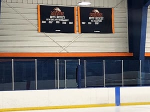
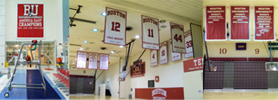
Avoid fully printed banners. An applique banner allows one to add new players and stats over time and is by far more visually pleasing. However, applique does have some limitations. For instance, gradients or designs with very small and intricate details cannot be appliqued. In those situations, we suggest ordering a hybrid banner. Hybrid banners seamlessly combine printed fabric with applique fabric allowing the banner to meet all design criteria and still provide the benefits of a fully appliqued banner.
Accent Banner has been producing hockey banners for decades and we are proud of the teams and player accomplishments each banner celebrates. If you have further questions or would like to request a quote for a custom hockey banner please feel free to contact us through this site, over the phone, stop in our shop, or send an e-mail! Thanks for visiting our blog. Now let’s go hit the ice!
High Schools, Colleges, and Universities across America are very proud of their athletics programs. Few are prouder than the basketball teams and the...
From French, appliqué (pronounced app-la-kay) literally means “that which has been applied.” As an art form, a common example of appliqué is found...

Gonfalons, commonly referred to as graduation banners, have long been a staple of commencement ceremonies across the world. There seems to be nothing...